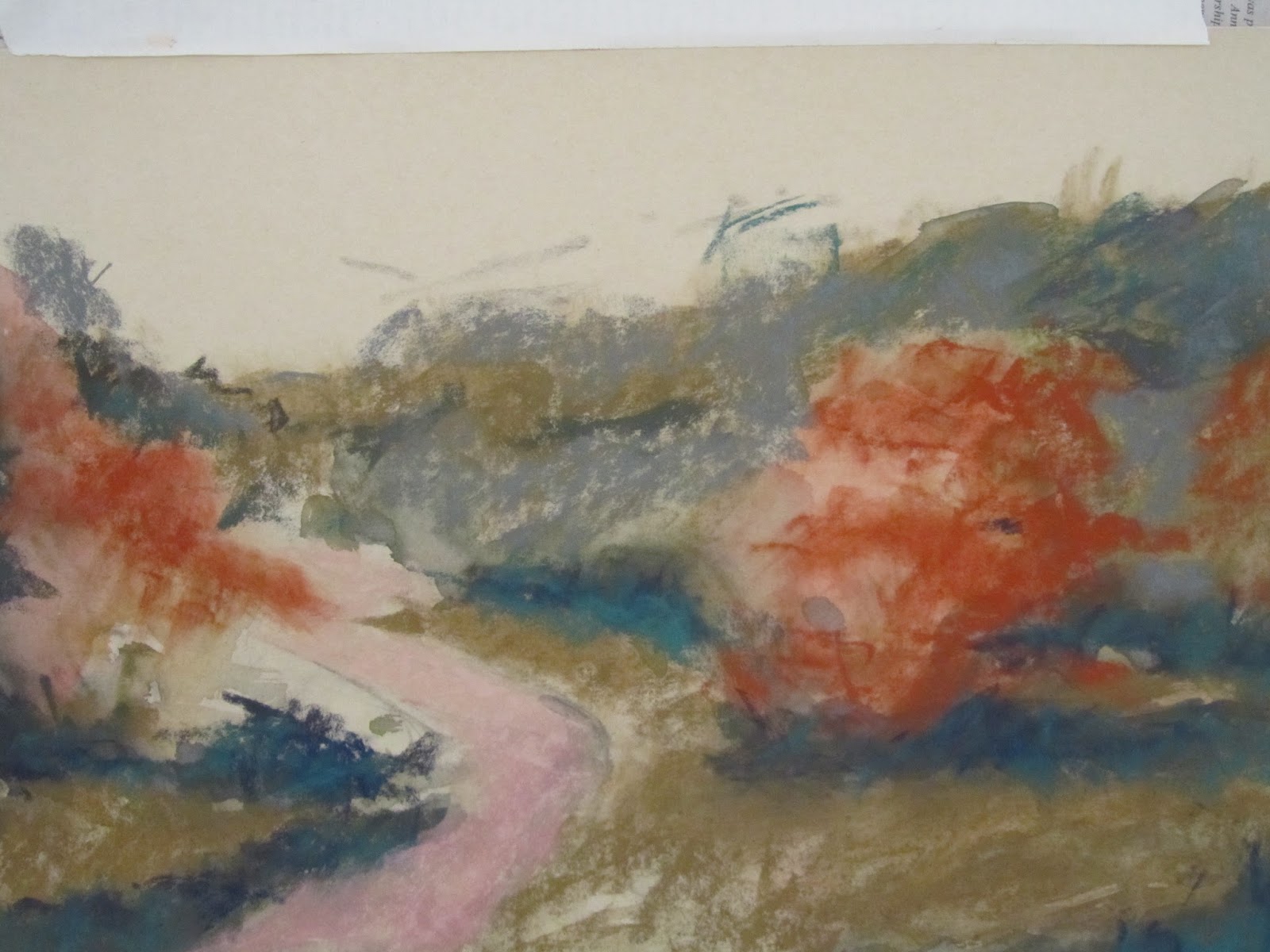
 After roughly sketching his landscape, Tom sprayed his Uart paper and applied a very loose watercolor under-painting.
  Next he began applying soft/light strokes of value - not necessarily color.
  Using values, he set up his painting from darks to lights and warms to cools.
  He added layer upon layer - all very lightly and loosely, eventually adding in some detail, but very little detail. He kept his paintings loose - almost abstract.
  This is not his finished piece, but close to it. After he sent us off to start our paintings, he did work a bit more on this. Jo bought this demo - very nice. You should click on the first pic above and then click through the photos to better see the progression of the painting.
 Then I started mine using the same under-painting watercolor technique and then adding value with pastels.
 It was difficult to get away from wanting to match colors. From my college days, I have well understood the idea of values vs. color, but Tom's technique held off on the local color until well into the painting.
 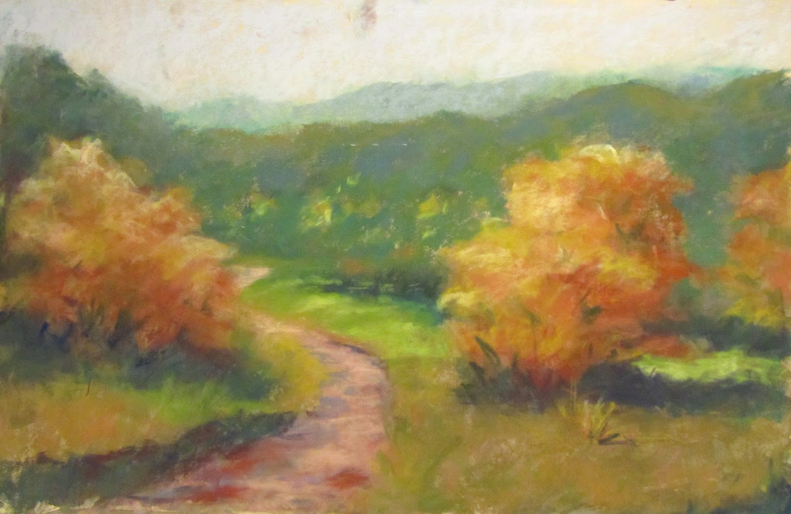 Of course, I painted-to-death this first painting. Although it needs lots of help, which I can do, it was a learning experience. I moved on and did the paintings that I posted yesterday.
 I started this last painting on the last day. It, too, needs some work, but I kind of liked it. In Tom's critique he said several times how he liked the lower left corner - liked what was going on - very abstract. I'm not sure I saw that, but I will try not to mess up the corner, and still work on the over-all painting.
I have another series of photos of a different Tom Christopher painting to show his technique again - if anyone is interested. It is cool to see the progression. Jo had a drawing app on her Ipad that showed the process of her drawings- she had all the cool toys!
7 comments:
Value? OK... if you say so! ;-)
I could have said darks to lights, but it also has to do with grays to brights. So you could have a red and a green that were the same value, but different colors. Tomorrow I will tell you all about penguins.
Buck, lesson 101 in value painting. If you put red and green of the same value and look at it in black and white, they look the same. I'm anxious to hear about the penguins!
Lou, your photos are great. I really, really like your paintings. It is always hard to try the new things and hold back on our own way of doing things. I hope we gleaned lots of info and made progress.
I think I learned lots, and I'm ready to apply it to my own paintings. There was lots going on yesterday, but today, I hope to try out my new art knowledge.
Have you used uart paper for just watercolor only? I've never heard of it until you mentioned it just now, but I never liked watercolor on regular paper when I tried it, so this seems better use (sans pastel).
I have never tried the Uart paper for just watercolor. It would be pretty rough - maybe too absorbing. I usually use regular 140 lb. cold press for watercolor. I don't like the 300 lb all that much.
We actually did a technique where after putting pastel on the Uart paper, then we went back in with water and moved it around. Sometimes artists spray their pastel to let it run and mix. Sometimes they use mineral spirits to do the same thing, but it dries faster.
@Jo: Thank ya, Ma'am.
Post a Comment